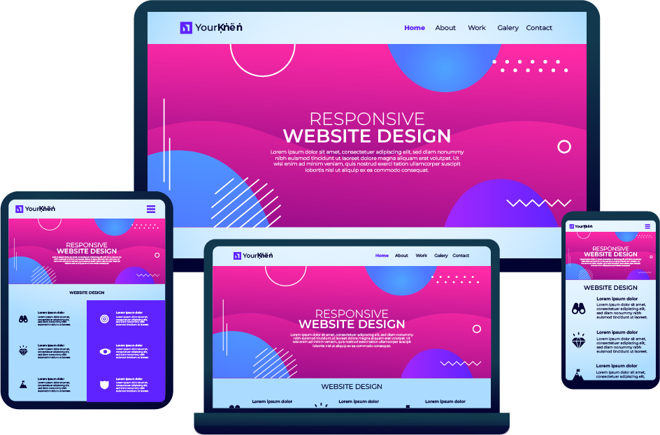
What is Responsive Web Design?
Responsive web design is a design approach that aims to create websites that look and function well on a wide range of devices and screen sizes. This includes desktop computers, laptops, tablets, and smartphones.
To achieve a responsive design, web developers use a combination of techniques such as flexible layouts, media queries, and flexible images and media.
Flexible layouts allow a website to adjust to the size of the device's screen by using relative units instead of fixed-width units. Media queries allow the website to apply different styles based on the size of the screen. Flexible images and media use responsive design techniques to ensure that they scale up or down properly depending on the size of the screen.
The goal of responsive web design is to provide a seamless and optimal user experience, regardless of the device being used to access the website. This is important because the number of people accessing the internet from mobile devices has significantly increased in recent years, and it is important for websites to be accessible and easy to use on these devices.
What is The Viewport?
In responsive web design (RWD), the viewport is the portion of a web page that is visible to the user in their web browser. It refers to the area of the browser window that displays the web page. The size of the viewport can vary depending on the device being used to view the web page. For example, on a desktop computer, the viewport may be the entire browser window, while on a smartphone, the viewport may only be a portion of the browser window.
To control the viewport in RWD, you can use the "meta" tag in the head of your HTML document. For example, to set the viewport to the width of the device, you can use the following tag:
<meta name="viewport" content="width=device-width">
This will ensure that the web page is scaled to fit the width of the device, allowing users to view the content without having to scroll horizontally. You can also use the viewport "meta" tag to set other properties, such as the initial scale of the page or the minimum and maximum zoom levels.
What is a Media Query?
A media query is a feature in CSS that allows you to apply different styles to a web page based on the characteristics of the device or display being used to view the page. Media queries allow you to create responsive designs that adapt to different viewport sizes and display conditions, such as screen size, resolution, and orientation.
To use media queries, you include a "@media" rule in your CSS, followed by a condition that specifies the characteristics of the device or display that you want to target. For example, to apply a style to a page when the viewport is less than 600 pixels wide, you could use the following media query:
@media (max-width: 600px) {
    /* styles go here */
}
Inside the media query, you can define any styles that you want to apply when the condition is met. These styles will be applied in addition to the default styles for the page, allowing you to create customized layouts for different viewport sizes.
There are several screens and devices with varying heights and widths, making it difficult to define an accurate breakpoint for each device. You may target five groups to keep things simple.
Extra small devices (phones, 600px and down)
@media only screen and (max-width: 600px) {...}
Small devices (portrait tablets and large phones, 600px and up)
@media only screen and (min-width: 600px) {...}
Medium devices (landscape tablets, 768px and up)
@media only screen and (min-width: 768px) {...}
Large devices (laptops/desktops, 992px and up)
@media only screen and (min-width: 992px) {...}
Extra large devices (large laptops and desktops, 1200px and up)
@media only screen and (min-width: 1200px) {...}
Always Design for Mobile First
Designing for mobile first means that you prioritize the design and user experience of a website or application on mobile devices over other devices, such as desktop computers. This approach is based on the idea that more and more users are accessing the internet on their smartphones and tablets, and that these devices have unique design and user experience considerations.
There are several benefits to designing for mobile first:
- It helps ensure that the user experience is optimized for smaller screens and touch input, which are common on mobile devices.
- It forces you to focus on the most important content and features of your website or application, since there is limited space on mobile screens.
- It allows you to test your design on a variety of mobile devices early in the design process, which can help you identify and fix any issues before moving on to other devices.
- It can make it easier to add additional features and content for larger screens later, since you have already established a solid foundation for the mobile design.
Overall, designing for mobile first can help you create a more user-friendly and effective website or application that works well on a wide range of devices.