Flexbox in CSS: A Beginner's Guide
Background and basics
CSS Flexbox is a new layout mode in CSS3.
CSS Flexbox Layout (CSS Flexible Box) feature intends to provide a more effective approach to arrange, align, and distribute space among elements in a container, even when those items' sizes are unspecified.
We can design flexible responsive layout structures without using float or positioning with the CSS Flexbox Box Layout Module.
The CSS3 flexbox mainly contains flex containers and flex items.
Flex container
The flex container act as the parent element. It is defined via setting the element's display property to flex or inline-flex.
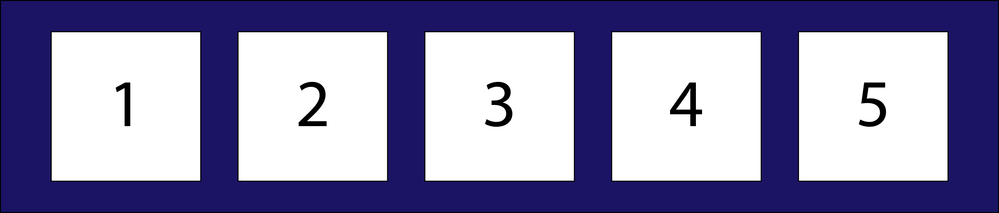
Flex items
The flex items act as the childrens of the flex container. There may be one or more flex items inside a flex container.
Properties of the flex container
display
Defines the flex container. It enables a flex context for all its direct children.
.container {
  display: flex; /* or inline-flex */
}
flex-direction
Defines the direction flex items are placed in the flex container.
.container {
  flex-direction: row | row-reverse | column | column-reverse;
}
- row: left to right
- row-reverse: right to left
- column: top to bottom
- column-reverse: bottom to top
flex-wrap
Flex items will wrap onto multiple lines inside the flex container.
.container {
  flex-direction: flex-wrap: nowrap | wrap | wrap-reverse;
}
- nowrap: all flex items will be on one line
- wrap: flex items will wrap onto multiple lines, from top to bottom.
- wrap-reverse: flex items will wrap onto multiple lines from bottom to top.
flex-flow
It is a shorthand property for setting both the flex-direction and flex-wrap properties.
.container {
  flex-flow: row wrap;
}
justify-content
This defines the alignment in the x axis.
.container {
  justify-content: flex-start | flex-end | center | space-between | space-around;
}
- flex-start: aligns the flex items at the beginning of the container
- flex-end: aligns the flex items at the end of the container
- center: aligns the flex items at the center of the container
- space-between: displays the flex items with space between the lines
- space-around: displays the flex items with space before, between, and after the lines
align-items
This defines the alignment in the y axis.
.container {
  align-items: stretch | flex-start | flex-end | center | baseline;
}
- stretch: stretches the flex items to fill the container
- flex-start: aligns the flex items at the top of the container
- flex-end: aligns the flex items at the bottom of the container
- center: aligns the flex items in the middle of the container
- baseline: aligns the flex items such as their baselines aligns
align-content
The align-content property is used to align the flex lines.
.container {
  align-content: flex-start | flex-end | center | space-between | space-around | stretch;
}
- flex-start: displays the flex lines at the start of the container
- flex-end: displays the flex lines at the end of the container
- center: displays display the flex lines in the middle of the container
- space-between: displays the flex lines with equal space between them
- space-around: displays the flex lines with space before, between, and after them
- stretch: stretches the flex lines to take up the remaining space
gap, row-gap, column-gap
This property controls the space between flex items.
.container {
  display: flex;
  ...
  gap: 10px;
  gap: 10px 20px; /* row-gap column gap */
  row-gap: 10px;
  column-gap: 20px;
}